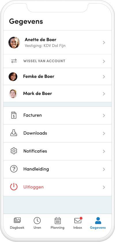
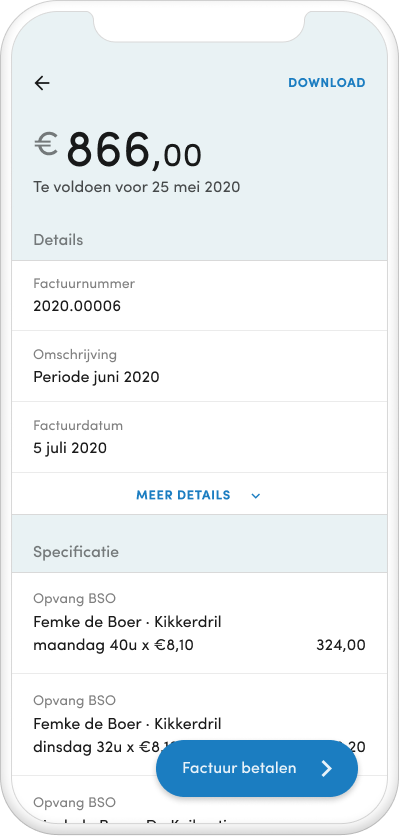
Ouder App
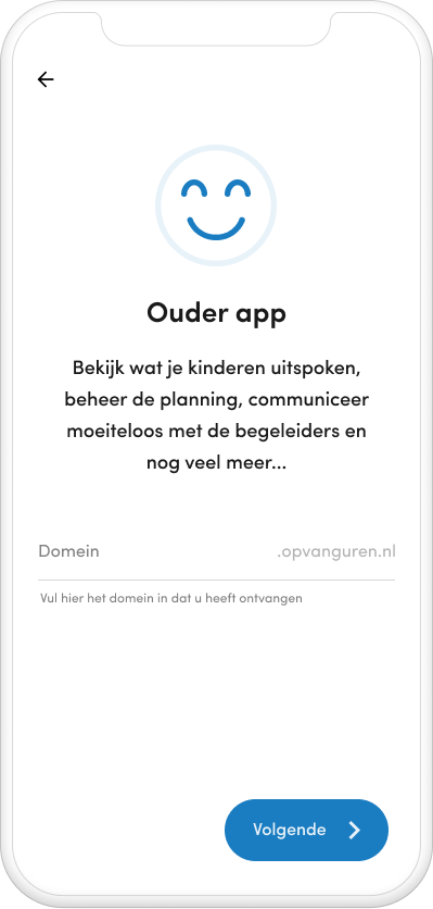
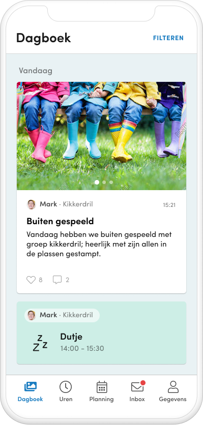
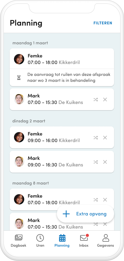
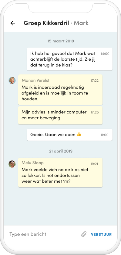
After three months of doing volunteering work all around Europe, I was approached by Atane software to help them design their new app. The apps’ target group are parents with kids at daycare and allows them to see updates about their kids, to manage their kids’ daycare schedule and other administrative data.
A web app with similar functionality already existed, but the interface was quickly becoming outdated and almost unusable on mobile devices. Most of the functionality for the app had to be based on this web app, hence most of the requirements for the design were collected from this source, but also from extensive interviews with the product owner and from research into the target group and existing solutions.
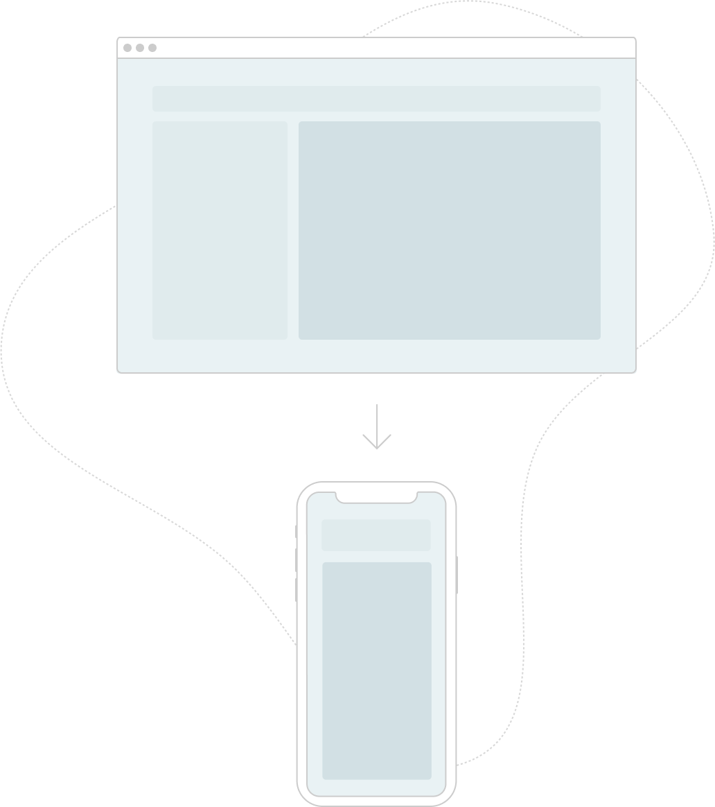
Effective use of screen real estate proved to be the most difficult design challenge, as the web app was designed to be used primarily on desktop computer screens. The goal was to have as much data and as many controls visible on the screen as possible to minimize the need for hidden commands and scrolling without creating an interface that would feel overcrowded and poorly organized. By adopting some well established mobile design patterns, like separating information into a simple overview and a stacked detail view, by using full-screen dialogs, floating action buttons, cards and toasts, I’m convinced I managed to create an interface that is both usable and visually appealing.
To communicate my ideas about the correct implementation of the design I created a clickable prototype including all possible interactions, like animations, fixed elements and any other possible UI changes. To encourage consistency and reusability during the development I used my own simple design system, including components, type, colors, etc, of which the attributes can be found in the delivered design.
During the development I worked together closely with the front-end developer to ensure my design was implemented pixel-perfect, which meant that I often had to dive into the React Native code to tweak any inconsistent styling. My years of (s)css experience proved useful, as most of the selectors turned out to be similar to those used by css. Seeing my design coming to life exactly the way I envisioned it was a rewarding experience.


