Zaaksysteem.nl
In 2009 I was added to the team of Zaaksysteem.nl. My initial task was to design their proof of concept and make it presentable to potential customers. The presentation was a huge success and in the following years, the company grew into a successful provider of SaaS case management software for Dutch municipalities.
www.zaaksysteem.nl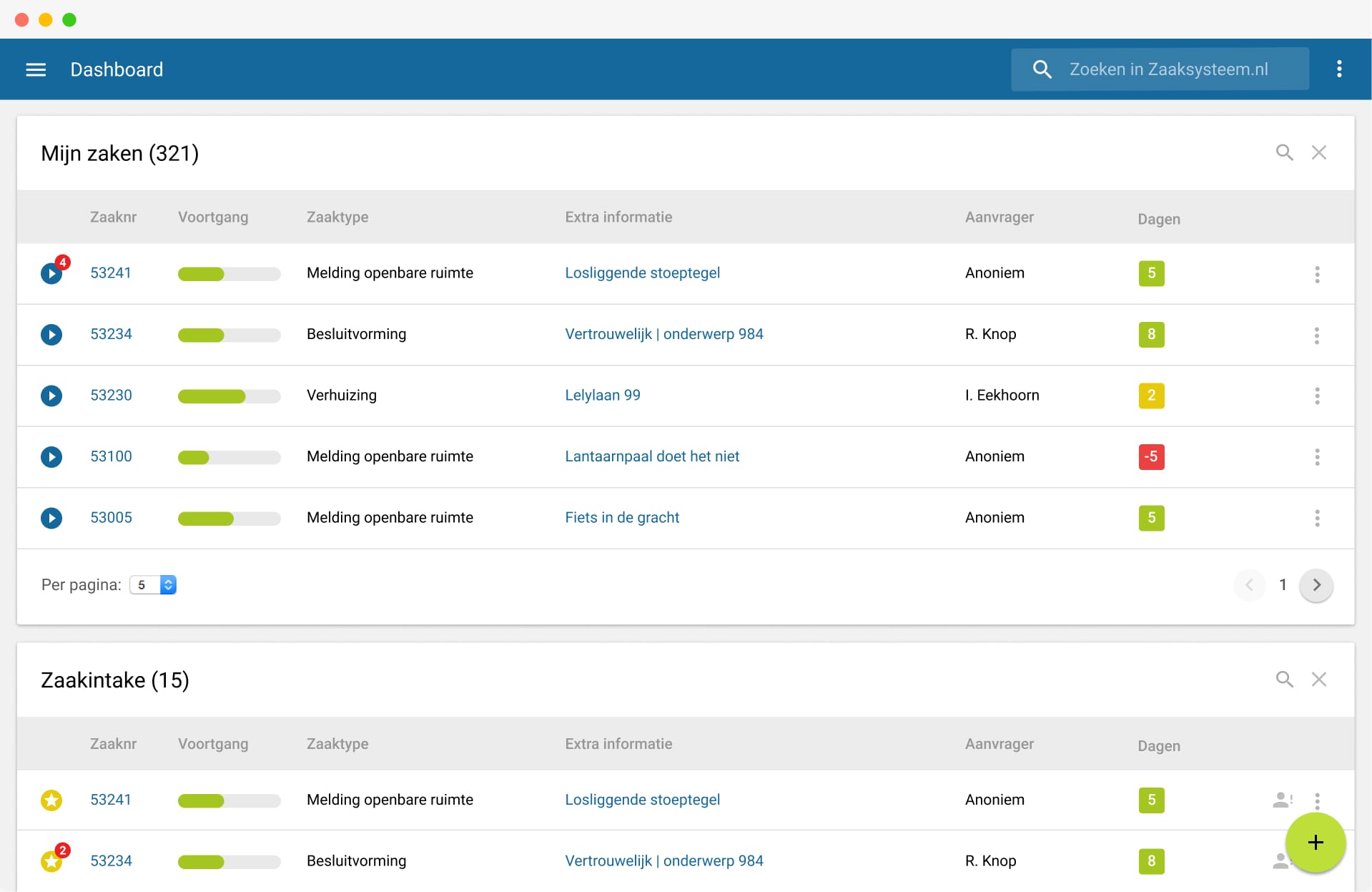
Zaaksysteem.what?
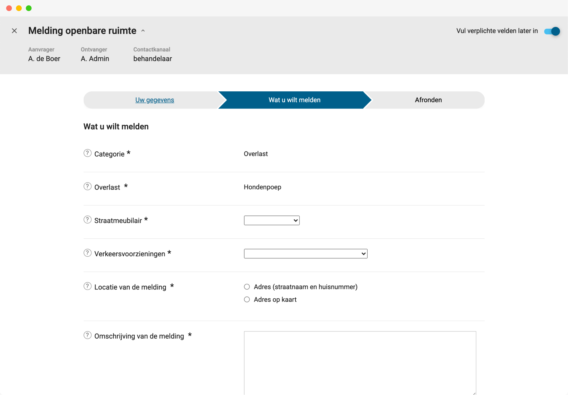
Zaaksysteem.nl is an enterprise level case management system developed for the municipal market, allowing municipalities to offer quality digital services and products to their civilians. Its power lies in its versatility: with it, you can design every possible municipal process, from requesting permits, passports, and subsidies to reporting anomalies in the public space to registering your newborn baby. The combination of a user-friendly UI and low costs shook up the market and caused a change of attitude towards small innovating software developers in the governmental branch.
My role at the company
In the eight years working for Zaaksysteem.nl, I designed three iterations of the UI, helped realizing many new modules, successfully implemented and managed a templating system, designed two apps and was in charge of designing and maintaining the brand, website and all their print material.
During those 8 years, I’ve seen the team grow and experienced the accompanying challenges that come with managing a growing team, e.g. communication struggles between the different parties involved (customer, support and development). I took part in finding appropriate solutions such as the implementation and perfection of methods like scrum and agile. I’ve worked in teams on large projects using tools like GitHub/gitlab, Jira and Docker, collaborating with talented front-end and back-end developers.
Given all these past experiences, I can say with confidence that working for Zaaksysteem.nl has transformed me from a small website designer to an experienced UX/UI designer.
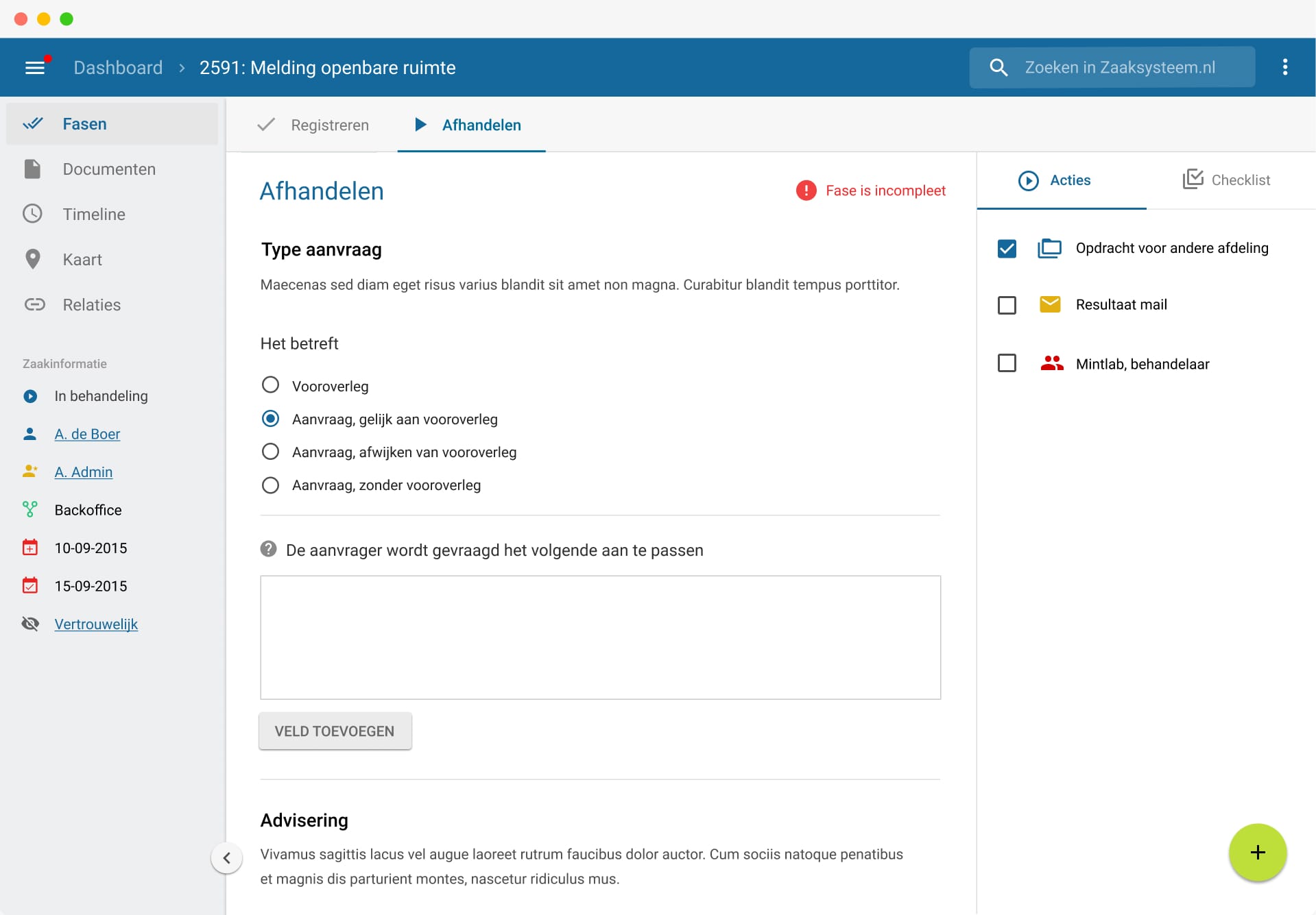
Redesigning the core of the system: the case file
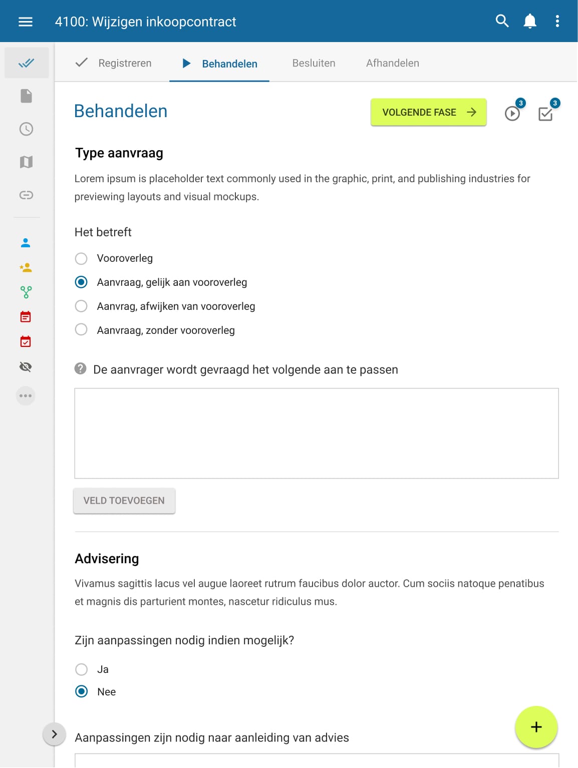
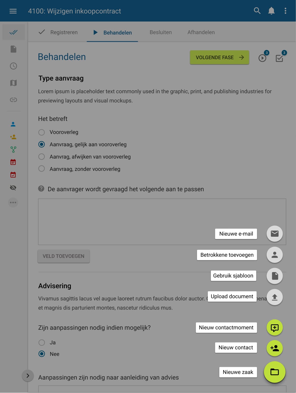
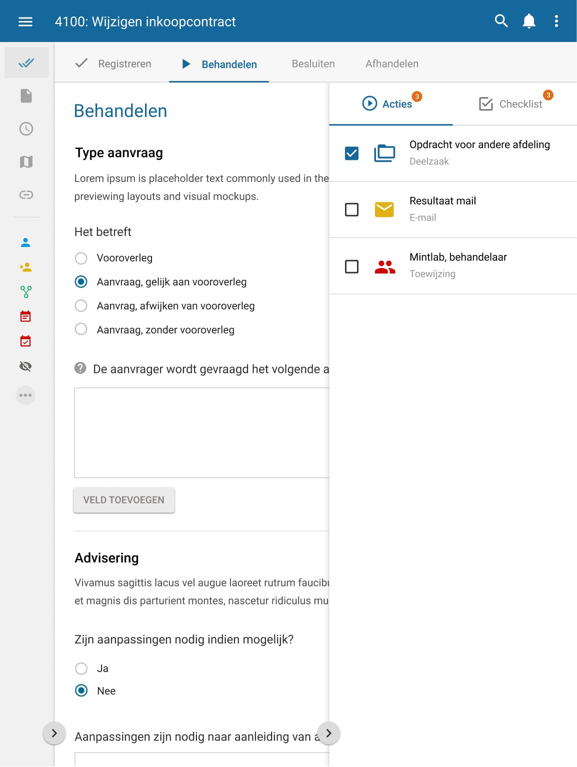
With technologies like tablets being used more and more by municipal workers, the request came to completely rethink and redesign the most often used part of the system: the case file. All the information concerning a case is collected and presented here, in one clear interface. The challenge was to make this interface available to the screen size of a tablet and keep it uncluttered at the same time. Using google’s material design system, I made many prototypes, all having the same problem: too many UI elements being stuffed in too little space. Finally, I managed to design an uncluttered version, using hidden toggleable side panels, much like in the latest design of Gmail. I presented the prototypes to our customers, applied their feedback and in the course of 6 months the UI was implemented, written in angular to replace our messy jQuery javascript code. The design is fully adaptive and even works quite well on smaller mobile devices. Up to this day it is being used and is still highly relevant.